The Lowdown
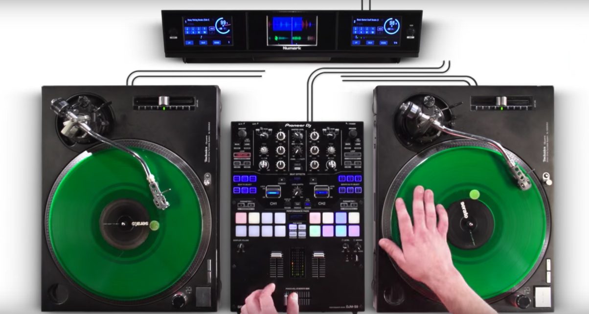
Add on three-screen display for Serato DJ users, that can be used with virtually all existing controllers to provide visual feedback over audio and mixes. It may appeal to DVS DJs who want waveform displays by their decks, and DJs who are big on screens but don’t want to replace an otherwise perfectly good controller. However, the limited screen size means compromises in library/search information. If you are really set on removing the laptop from your visual DJ set up this could be something to look at.
Video Review
First Impressions / Setting up

The Numark Dashboard has a PC USB port for connecting to your laptop, two additional USB ports for connecting hard drives and controllers, and a power socket for connecting the supplied adapter.It’s a nicely built unit, in metal. It certainly looks and feels professional. It has a metal bracket base with rubber strip feet on it, and two bolts connecting this to the main part of the unit, which is about an inch thick and maybe 18″ long, with the three 4.7″ screens on top protected by a flexible plastic sheet. There are only two buttons on the top panel, those being a “Deck” button (for switching between primary and secondary decks in four-deck Serato set-ups) and a “View” button, for changing what’s shown on the screens, as well as changing some library functions (more on this later).
Around the back is a small central in/out panel, with a power on/off, a DC 12V in (a transformer is supplied), cable restraint, and two USB inputs (so you can connect an external hard drive or USB drive) as well as a PC USB socket.
The idea is you plug the Dashboard in between your laptop and controller. You perch it behind your controller and adjust it so you have the three screens right where you’d naturally glance when DJing. One niggle for me was that it was impossible to butt the unit up tightly against the back of the controller I tried it on (Denon DJ MC4000) because it needed to sit apart from it so the leads could plug in to the back of the Denon unit, the input/output part of the Dashboard gets in the way.
In Use

There are basically two views available to you. View 1 has the left and right screens showing you waveforms and various other info (track details, BPM, time, pitch, auto loop settings, FX settings) while the middle screen permanently shows you the library. View 2 has the same info but with Serato’s round jogs instead of the waveforms on the left / right decks, the waveforms shifting to “stacked” parallel waves in the middle screen; in this instance, when you turn your controller’s browser knob, the middle screen switches temporarily to library browse view. The screens are bright (though not as bright as a laptop) and they’re not touchscreen, in case you were wondering.
When compared to other Serato controllers with screens, this system works better because it only has one “library” view (ie on the centre screen), whereas on other similar controllers it is possible to dial up two library views (one on each screen), the concern being that they are both showing the same thing, so scroll one, and the other scrolls too. It’s a limitation of Serato (after all, the software only has one library), but it’s confusing. It’s solved here in this way.
The issue I have with all of these systems so far is that not enough info is displayed on the small screens. For instance, no hot cue info is on there. Worse, the library view is very limiting. Although you can “sort” according to the Dashboard right-hand button, it’s misleading – what that button does is toggle between BPM, key and track length in the final column on the library view. So if you want to sort a playlist to see everything in a particular key in one place, then yes, you can display the key info but no, you can’t then sort using that.
Basically, the sorting has to be done by clicking the column on your laptop, which kind of defeats the object. You can’t display Genre in the library too, something else I missed DJing this way. You can get around these things by being a little more organised with the way you prepare your playlists, but really what’s needed are bigger screens with more info on.
All that said, it does feel good not looking at the laptop to DJ, and you can even close your laptop if you set it to not automatically sleep on closing (there are utilities that’ll help with that). The waveforms are big and clear (bigger than on a 13″ MacBook screen, actually – at least, taller) and another benefit of having that third screen is being able to use it for parallel waveforms – a boon compared to two-screen controllers of this type.
Conclusion

This is a niche product. To start with, you have to not want to have your laptop on display in the first place (personally I don’t mind that at all, and I prefer having Qwerty search for tracks, and superior library view, among other things). But if you really want to hide the laptop away, you then have to accept the Dashboard’s limitations, especially in the library area.
If you can, though, it’s an attractive, well-made device that adds an extra option for DJs looking to alter the way they perform, and the way their audiences perceive them to be performing. It may particularly appeal to DVS DJs who want waveform displays right there by their decks, and also as mentioned right at the start, to DJs who are sold on screens but don’t want to replace an otherwise perfectly good controller. For me, though, this idea isn’t quite mature yet.


